Why I said goodbye to WordPress for custom-designed blogs
A brief rationale for ditching my WordPress-powered site and creating a new one using the R package blogdown and hugo.

I’m not gonna lie, building a website, especially on a foreign framework, is time-consuming. Even the smallest of bugs can take hours to localize to a specific line of code or setting. Like most people who aren’t developers, I started with the best-known free option for building blog sites: WordPress. But the more I learned more about SEO and UX, the more agonizing WordPress was to work with. After a lot of hassle, I eventually trashed my old site and created this hugo-powered one.
TLDR: Here’s a quick comparison of WordPress vs. hugo features based on my personal experience:
| WordPress | hugo | |
|---|---|---|
| Free Hosting | ❌ | ✔️ Using Github Pages or Netlify |
| Free Themes | ✔️ | ✔️ |
| Easy to Learn | ✔️ | ❌ |
| Easy to Customize | ❌ | ️✔️ |
| Speed Index* | 11.56s | 1.68s |
*These values are explained in more detail below and are not representative of all WordPress or hugo-powered websites
For the sake of being objective, I’ll acknowledge the many positives of the open-source CMS beloved by many before getting critical. Please bear in mind that these are just my opinions, and you’re more than welcome to disagree (privately).
Why WordPress works for so many people
In terms of popularity, WordPress dominates the content management systems sphere with a 63.6% market share in October 2020. Say what you want, but WordPress does a great job catering to the mass market of consumers who just want a website without writing any code. Here are just a few reasons why.
1. It’s free, all you need is hosting and a domain
When I talk about WordPress, I mean .org not .com. The distinction between the two is that WordPress.org is open source software you can install for free on your hosting plan, and WordPress.com is a hosting provider that offers WordPress sites in exchange for money.
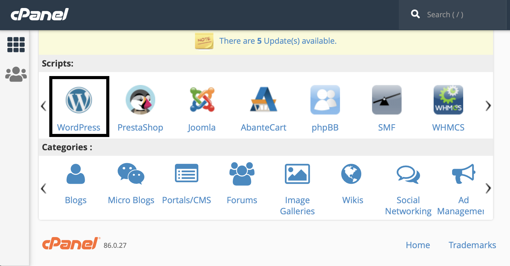
If you want the easiest option, just pay and get your domain, hosting, and WordPress installation handled for you. If you want to save cash, all you need to do to install the free version is click a button in cPanel (used by many shared hosting providers like Bluehost and Namecheap). If that sounds daunting, don’t worry. There’s an entire hosting support team waiting to help you with any issues.

See, easy peasy.
2. It’s kinda user-friendly
I feel that a lot of complaints about WordPress usability are exaggerated. Sure, it’s dashboard could be sleeker, but what open-source software wins design awards? By definition, open-source projects don’t have revenue, which means they don’t have the resources to invest in fancy UX design teams to find ways to make clicking a button more enjoyable for you.
If you want a more intuitive UI, pay a team to design a custom CMS for you. Otherwise, invest the small amount of time it takes to play around and figure things out. It’s pretty easy to wrap your head around the WordPress dashboard and there are thousands of guides and videos available for when you get stuck. It’s always good to start with a dummy site, especially if you want to experiment with changes in the Editor.
3. It’s easy to integrate third-party services
Plugins are what makes WordPress so powerful for the coding-impaired, and they’re just a click away. You can add plugins to handle cache, auto-compress images, add in a web-shop, manage your search engine optimization tactics, add animated unicorns to keep your site visitors entertained, and basically anything else you can think of. If you don’t believe me, Google whatever comes to your mind and I guarantee there’s a plugin for it. 🦄
4. There are plenty of free themes to choose from
This is where the pros will eventually become cons. Yes, there are hundreds of themes to choose from that will cost you nothing. If you can’t find any you like in your dashboard, you will find even more free options on Themeforest.
If you’re a person of simple tastes, these will work just fine for you. Unfortunately, I love making things complicated. I was very particular about how I wanted my website to look, and every theme I tried had something I didn’t like and I just couldn’t let it go. This is where things got messy for me.
When WordPress becomes a huge pain in the a**
If you are a control-freak when it comes to website aesthetics, WordPress can be an absolute nightmare. Your attempts to adjust things will create CSS conflict after conflict until your website becomes a Frankenstein monster that takes eons to load. Warning: I am going to start ranting now.
1. Changing theme aspects that aren’t available in the Customizer
Want to change the padding on your menu or update your footer? Enjoy sifting the incomprehensible PHP gibberish in your header file, navigate to your CSS file, and, if you’re lucky, you’ll find the class of the object you’re looking to modify. If not, well, enjoy the 50 pixels of fluff surrounding your menu bar that looks absolutely nothing like the preview of the theme you chose. Go ahead pick another theme, but this time you can’t use the Google Font you want, and the featured images of your blog posts come in the dimensions of a Twizzler.
It’s not impossible to modify WordPress themes beyond the Customizer panel, but it’s annoying as hell. Very often you are left with no choice but to add !important tags in your Custom CSS, which is far from best-practice. Once is fine, but if you have dozens of them it’s not really going to help your page performance. Naturally, I Googled alternatives to this maddening game of hide-and-seek with my CSS classes and came across what is advertised as the holy-grail of WordPress customization: Elementor.
Elementor: great in theory, awful in practice
While there are other page-builders, I went with Elementor because it had more online resources to turn to if I ran into trouble. Plus, it didn’t take me long to find plugins that snuck me behind the paywall, giving me access to all the Pro features I needed. Without these, you won’t be able to do a range of important things, like adding a custom header or footer to replace the one in your theme.
With Elementor, you can arrange blocks on your web page, set global fonts, colors, and text styles to make things look exactly how you want. It does take some time to understand if you’re unfamiliar with web design terms like fixed vs. absolute positioning or margins vs. padding. However, you get a live preview of your changes so you learn what’s what pretty quickly.

Seems perfect, right? If Elementor would locate and replace the CSS in your theme then yes, this would be awesome. But no, it adds its own CSS file with your desired styles or adds new inline CSS in a grand mess if you’d like it to, and once every few visits you will get an awkward mix of your chosen settings and theme defaults. Delightful.
Besides the CSS mess, Elementor makes the same decisions about how your page looks over and over again with every load, slowing down your website. I won’t bother paraphrasing, but I’ll leave this explanation from an excellent post by PAgePipe on the effects of page builders like Elementor on page speed here:
Pagebuilder authors load variables from databases. This triggers many slowdowns. How much padding do you need? What color? Border or not? Round images or squares? etc. Configuration decisions and selections run in real-time. These repeat the same redundant decisions on every page load.
2. The page speed :persevere:
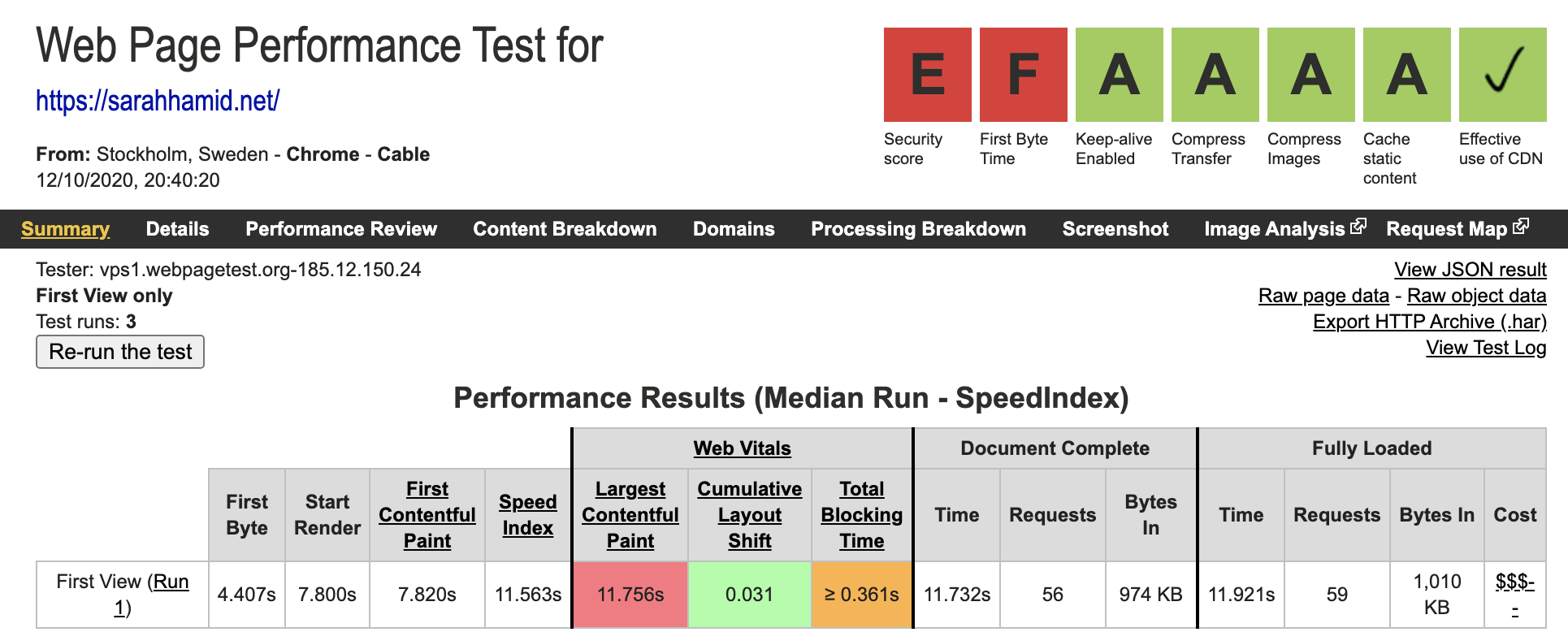
Before blaming page-builders or WordPress, I’d like to make a few things clear by sharing my WordPress site’s results from Catchpoint’s Web Page Test:
- I used Cloudflare, a content delivery network (CDN) to speed up page loads
- All images on my site were compressed
- I had gzip enabled in cPanel
- I used browser caching via the plugin W3TotalCache
- My website was SSL-encrypted, the bad security score comes from missing a few additional security headers (fun fact: they seem to be missing on nearly every Estonian major media outlet, so I think I’ll be fine until I figure out how to add these in)

Yikes, 7 seconds for the First Contentful Paint isn’t just bad, it’s abysmal. This metric describes how long it takes for the page to start rendering content on the screen. This is more important than the total time to load. That’s because perceived page speed is what will make people bounce, not actual end-to-end load time.
But yeah, either way, not good.
Back to blaming WordPress page builders * cough * Elementor
We’ve already established that Elementor messes with page speed because of the way it uses additional variables and database queries to style web pages, which take more time than just running PHP. But I have te tot mention the sheer size of the plugin! Elementor alone adds 17.7M when decompressed, plus another 6.1 if you have Pro. Together, they make up the same weight as half of WordPress core, which definitely doesn’t improve the maddeningly slow page loading time.
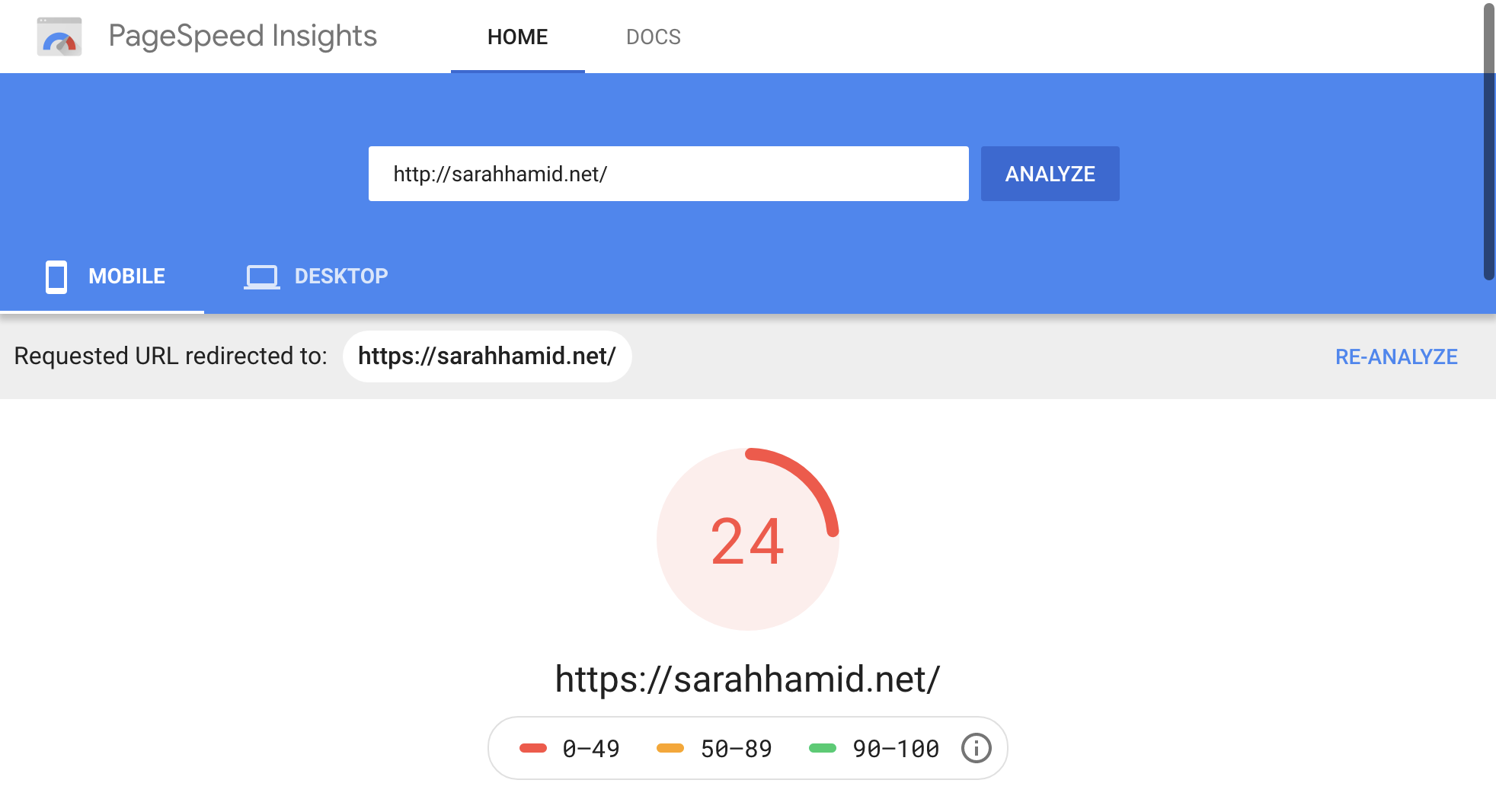
Bearing in mind that mobile speed is even more affected by page weight as it consumes connection speed, the Google Page Speed Score below comes as no surprise.

While I did just about everything a non-developer can do to speed up the site, there is a lot more you could do to fix this if you take the time to get familiar with SQL databases and PHP. This blog post, for example, is the most comprehensive guide to WordPress optimization I have ever seen, and I barely scratched the surface. Honestly, though, starting over from scratch seems like a much better use of my time and, better yet, a great opportunity to learn about the basics of web development.
3. Using WordPress limits your knowledge of web development to its dashboard
Impracticalities and inefficiencies aside, Elementor and WordPress are shortcuts that bypass gaining valuable web development skills. I know we live in an era where everybody wants an easy way to do things on their own with minimal effort, and that’s cool. After all, there’s plenty of demand for quick, allegedly painless web building services out there (Squarespace, Wix, etc.).
Despite my many attempts at improving speed and design, I always found myself compromising on one for the other. But I want it all, baby.
That being said, I have no desire to learn PHP, so I started looking for options that would build on the skills I have. Since I am learning R, I was lucky to stumble across a few stats blogs that seemed to have a consistent layout and were ridiculously fast. Eventually, I figured out what they were using to create their lightning-speed sites: blogdown and hugo.
The combined awesomeness of blogdown and hugo
blogdown is an R package that makes it possible to build websites and blogs using R Markdown and hugo, a static site generator powered by Go, a programming language developed at Google. On the project’s website, hugo is described as the world’s fastest framework for building websites, and the page speed results for the hugo-powered sites I found only validated this claim (First Content Paintful ~ 1s).
Rather than go through an extended explanation of the other pros of this duo over WordPress, here’s a list:
- Superfast (see the next section for evidence)
- No need for plugins
- Comes with hundreds of beautiful, responsive themes (from this century)
- 100% open-source (not a cent spent)
The page speed :relieved:
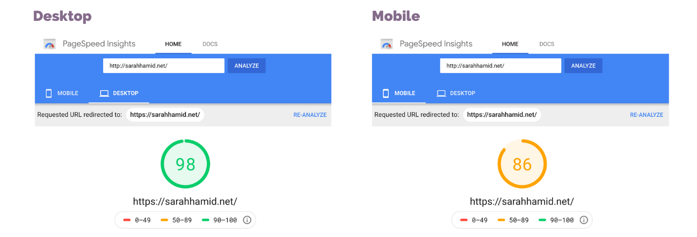
Words cannot describe the satisfaction of seeing that near-perfect desktop speed score. I do feel obligated to mention, though, that the Google Page Speed score has been widely critiqued, and that I also do not have much real-world data given that I launched this less than a month before the test.

Using the more precise Web Page Test tool gives me more info on the Speed Index and First Contentful Paint, both are around 1.5 seconds, nearly 5x faster than my previous WordPress site.

The downside: why only 0.1% of blogs are powered by hugo
I’ll be blunt, it’s hard to figure hugo out.
The main reason why is the lack of resources available for beginners compared to WordPress and HTML/JS development. While the guides from the developers of both the blogdown package and hugo are comprehensive and clear (I added the links below), they don’t include solutions all the random, trivial errors you get as a newbie.
For example, it took me about an hour to figure out how to change the icons in my menu. It seems simple enough now that I figured it out, but these kinds of questions do pop up and leave you mystified when you work with unfamiliar frameworks. Trying to Google something like ‘How to change menu icons in hugo theme Future Imperfect Slim’ and find a thread on StackOverflow did not work for most of these situations. Long story short, you will have to use trial and error to figure this sort of stuff out.
I put together a list of resources that, should you want to try making a website with hugo, will help you get the job done as long as you’re willing to persevere through the initial confusion.
The resources I used to help me get started
Note: I do have some base knowledge of R and elementary web development skills, and this still took me some time to understand. I ended up creating multiple websites, both accidentally and on purpose, before figuring out how to create the final result you’re looking at.
How to Install and Set Up hugo
The two main resources I used to set up hugo, which is done using the blogdown package in R, can be found in the following links. I recommend getting familiar with Terminal since it can help with downloading themes manually in case you run into errors the traditional way.
blogdowndocumentationhugodocumentation- The basics of Terminal
- This blog post filled in quite a few blanks, so it may help you get started
Helpful guides for the small stuff
As I mentioned earlier, I ran into a couple of confusing problems when trying to customize things. Here are some helpful links in case you want to do any of the following:
- Finding new Font Awesome icons
- Shortcodes for adding emojis to your web pages
- More info on YAML/TOML front matter
- How to set up a free contact form
- Get HTML and CSS templates for additional content on your site
- How to add a cookie consent banner
- How to canonicals, auto-generated meta-descriptions, and more SEO stuff
Deploying on Shared Hosting Using Git, Github, and Netlify
I used Netlify to deploy my website, which isn’t as complicated as it sounds. Here are some solutions to the problems I ran into to help you breeze through this process:
- If you used Git to clone your
hugotheme you will get an error. You will need to delete the theme from yourthemesfolder and create a submodule using the following command instead:$ git submodule add https://github.com/themecreator/themename - If you have a working Netlify SSL and you still get a “not secure” verdict from your browser, just update the SSL certification in Netlify and it will work. Not exactly groundbreaking, but I was by far not the only one who encountered this issue and it seemed like the only decent solution.
And here are some resources for going live:
- Github guide to adding an existing repository using Git
- Netlify’s guide to deploying your Github repository
Conclusion: If you have time, interest, and a love for sleek and speedy websites, go for hugo
That’s just my opinion. Feel free to challenge it. :)


